
Creating an increase in health engagement for both direct consumers and enterprise users
OVERVIEW


Who is Ovia Health?
delivers the #1 health solution for women and families. They also add extra support throughout the parenthood journey. Ovia Health's consumer products have helped more than 11 million women and families make important life and health decisions through B2B Employers

What is the Health Assessment (H.A.)?
Ovia created a health assessment in order to give their users personalized content. Ovia would also be able to address any pre-existing conditions that a user could have and suggest possible solutions through the online chat feature with Ovia's coaches. This Assessment gives Ovia a chance to fully understand their users and present related articles and advice throughout the apps news feed.
SO...WHAT'S THE CHALLENGE?
Our users are not understanding the reason for the health assessment. They are unaware of what programs they’re enrolled in and confused as to why they are receiving health prompts.
My Role
The complete research and development
# of Team Members
One
Timeline
5 (2 weeks) sprints
Tools Used
Sketch, Adobe XD, Illustrator, Photoshop
My Process

RESEARCH

-
Who is the user?
-
How does the health assessment work?
-
Why was the health assessment created?
-
Are there outside examples?
Journey map
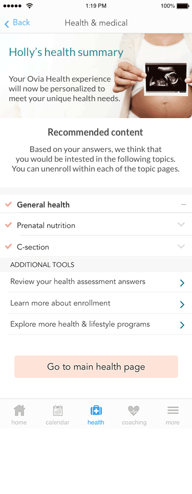
Users did not understand the purpose of the Health Assessment, which is the core component of the enterprise product. A summary may be needed in order to bridge a gap between the assessment and the Native health page.

Summary
This will give the users more understanding of how their medical history and risk factors influence their Ovia experience. This is important because it connects all of the tools provided to an enterprise user, and gives them more control over their experience.
Competitors
Direct & Indirect competitor analysis

Interviews:
440 responses through survey monkey.

Affinity Mapping

Based on the results, I wrote done the comments that were repetitive and that stuck out to me and spent some time looking for a pattern.
This process gave me confirmation that I was heading in the right direction.
A summary was needed!
Thoughts & Reflections: RESEARCH

-
Goal is to increase understanding and utilization of the enterprise product, thus
increasing engagement
-
Goal is to decrease pain points for users such as…
-
Annoyance with seeing prompts daily that aren’t relevant to them
-
Confusion with how/why they are enrolled in health programs and how to make changes
-
The research that I compiled was generated so many ideas. At this point, I was excited and apprehensive about the whole project. I needed to take everything that was discovered and then create a design. So I started sketching and went from there…
IDEATION

-
How could this look?
-
How will this work for users?
-
What is the MVP?
-
Any possible design phases?
Wire-framing: Lo to Hi Fidelity

MVP: A personalized welcome message, a topic list, a short explanation for the assessment, and a button to the Native Health page.
Design Alert:
Ovia is going through a new branding phase. The colors were addressed and were considered when creating the designs for the summary and health prompt.
USER TESTING


-
Does the design work?
-
Is this the right design?
-
Are there any changes needed?
-
Can I make it better?
Testing & Iterations
After meeting with my project manager and engineers, I decided to scale back a few ideas such as removing:
1. The "Additional tools" menu because it is repetitive once the user is on the health page.
2.The expanding description menu that would be assigned to each topic. Users would be able to locate the description further on the health page.
After, I continued my testing with users to ensure that the flow made sense and that the wording was appropriate.
*The aha moment was realizing that first-time health assessment users would likely only see this summary once so simplicity was key.
Before
After

-
Deciding which design best solves our users' problem and enhances their H.A. experience.

CHOICE
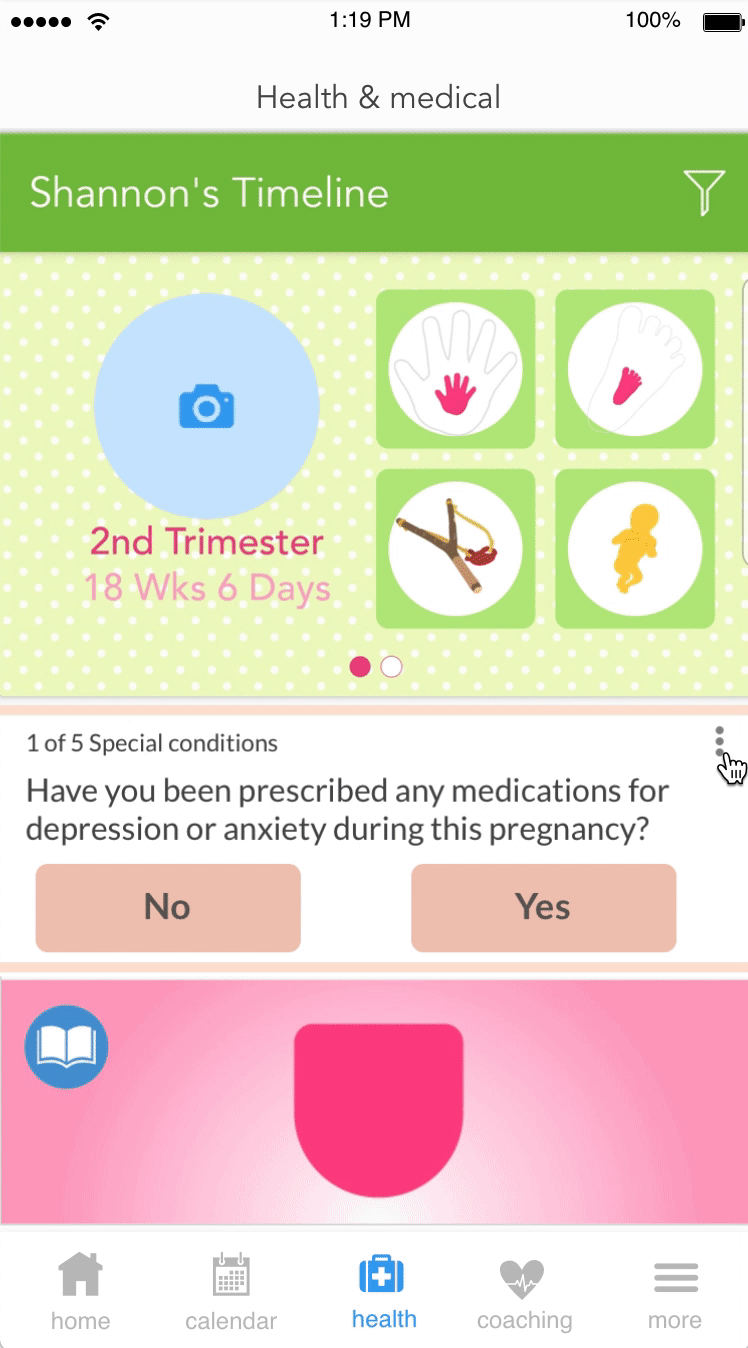
So what about the opt-out feature?


I still felt that giving users the opportunity to opt-out of specific topics was still important to the overall experience so while speaking with my manager; the idea of making it easier for users to locate the opt-out button when they are introduced by each prompt was made.
A prompt is located on the main screen of each ovia app.
Before

Health Prompt
After
GETTING TO READY

-
Dot the i's and cross the t's
-
Behavior is explained
-
Visual is shown
-
Tested with users
-
*Approve it by manager(s)
TAKEAWAYS
EMBRACE UNCERTAINTY
You might not always know all the answers but need to learn how to move forward. Gather resources as much as you can and make assumptions that can be tested with research. Ask questions and reach people outside your bubble to get fresh feedback on your ideas.
GET FEEDBACK EARLY
Get feedback often and early in your design process. You should not be afraid to show incomplete or scrappy work as long as you can explain your design decisions. But you should be clear about what you need from the critique.
BE INTENTIONAL
Always be intentional about color and font choices. You should have a clear reason for using that specific style. Sometimes people get distracted by visual elements that you have not intended to move forward with.